More Than Just Geography: Why a Swapped Map of Sweden and Finland is a Warning for Every Investor
In the world of high-stakes finance and global economics, precision is paramount. Trillions of dollars move on the basis of data, models, and analyses that are assumed to be accurate down to the last decimal point. It is a world that prides itself on meticulous detail. That’s why a seemingly trivial correction published by the Financial Times—a publication that serves as a daily scripture for many in this world—is so profoundly instructive. The correction, in its entirety, read: “The nations of Sweden and Finland were transposed in a map in the Life & Arts section last weekend.”
A simple mistake. A cartographical slip-up. On the surface, it’s a minor gaffe, easily corrected and forgotten. Yet, for anyone involved in investing, trading, or economic strategy, this small error serves as a powerful and humbling metaphor. If an institution renowned for its accuracy can inadvertently swap two prominent European nations, it forces us to confront a critical question: Where are the “transposed maps” in our own financial models, investment theses, and economic forecasts? What seemingly small assumptions are we getting wrong that could lead to disastrously misplaced capital?
This single-sentence correction is more than just an amusing footnote; it’s a masterclass in the nature of risk, the fallibility of human (and machine) analysis, and the non-negotiable necessity of rigorous due diligence. It reminds us that in the complex geography of the global economy, misreading the map isn’t just a matter of ending up in the wrong country—it can mean ending up on the wrong side of a market crash.
The Cognitive Glitch: When Financial Maps Get Redrawn by Bias
How does an error like transposing Sweden and Finland happen? One can imagine a designer working on a deadline, relying on a mental shortcut. Both are Nordic countries, their flags share a similar cross design, and they are geographical neighbors. The brain, seeking efficiency, lumps them together. This is a classic cognitive bias at play—a mental shortcut that, in this case, led to a factual error. The world of investing is dangerously littered with these same cognitive traps.
Investors and analysts often believe they are operating on pure logic and data, but their decisions are constantly being shaped by unseen psychological forces. The “transposed map” error is a perfect analogy for several of these biases:
- Confirmation Bias: This is the tendency to seek out and interpret information that confirms our pre-existing beliefs. An investor bullish on a particular stock will actively look for positive news while dismissing negative reports. They are, in effect, drawing a map that shows only the smooth roads to profit, ignoring the hazardous terrain clearly marked by others.
- Availability Heuristic: We often overestimate the importance of information that is easily recalled. After a series of tech IPOs deliver spectacular returns, investors might pile into the next one, assuming a similar outcome. They are mistaking a small, recent part of the map (hot IPOs) for the entire landscape of the stock market.
- Anchoring Bias: This happens when we rely too heavily on the first piece of information offered. A trader might see a stock’s 52-week high of $200 and, when it drops to $120, perceive it as “cheap,” anchoring their valuation to the past peak rather than its current fundamentals. Their financial map is permanently marked with an old, irrelevant landmark.
Just as Sweden and Finland have vastly different economic structures and strategic importance despite their proximity, two companies in the same sector can have fundamentally different balance sheets, leadership, and growth prospects. Treating them as interchangeable is a financial cartography error of the highest order.
The Hunter Becomes the Hunted: When Tech's Greatest Disruptors Face Disruption
Systemic Failure: When the Entire Atlas is Wrong
The FT’s error was a contained mistake. But what happens when the flawed map is not just one illustration, but the entire atlas used by the global financial system? This is precisely what has led to some of the most catastrophic market failures in modern history.
Consider the 2008 Global Financial Crisis. The complex models used by rating agencies to assess mortgage-backed securities (MBS) were, in essence, faulty maps. These models transposed risk, labeling bundles of subprime, high-risk mortgages as “AAA”—the safest investment rating possible. According to an investigation by the U.S. Senate, these flawed ratings “were a key cause of the financial crisis” (source). Investors, banks, and institutions all over the world used these maps to navigate their capital. When the underlying geography—the reality of millions of homeowners defaulting—revealed itself, the entire system built upon that faulty atlas collapsed.
A similar story unfolded with the 1998 collapse of Long-Term Capital Management (LTCM). The hedge fund was run by Nobel Prize-winning economists whose quantitative models were seen as the most sophisticated financial maps ever created. However, their models failed to account for the possibility of a Russian government debt default, a “black swan” event they considered statistically impossible. Their map simply didn’t include that part of the world. The fund lost $4.6 billion in under four months, requiring a massive bailout to prevent a systemic meltdown of the global banking system.
Correcting the Course: The Role of Financial Technology and Blockchain
If human bias and flawed models are the sources of our faulty maps, how do we create better ones? This is where the transformative potential of modern financial technology comes into play.
The fintech revolution is, at its core, a map-making revolution. It provides tools that offer greater clarity, transparency, and data integrity, helping investors and institutions navigate with more confidence.
- Data Analytics & AI: Modern fintech platforms can process vast datasets in real-time, identifying anomalies and correlations that human analysts might miss. They can act as an automated fact-checker, cross-referencing thousands of data points to ensure the map reflects the territory, flagging when a company’s financial statements don’t align with its operational data, for example.
- Democratization of Information: High-quality data and analytical tools that were once the exclusive domain of large investment banks are now available to a much broader audience. This allows more people to challenge mainstream narratives and create their own, more accurate financial maps.
Perhaps the most powerful map-correcting technology is blockchain. At its heart, a blockchain is a distributed, immutable ledger. It is a map that, once drawn, cannot be secretly altered by a single party. This has profound implications for correcting the “transposed” data that plagues so much of the financial world.
In areas like trade finance and supply chain logistics, disputes and fraud often arise because each party has its own version of the “map”—its own ledger of transactions. Blockchain creates a single, shared, and cryptographically secured source of truth that all parties can trust. According to a report by Deloitte, blockchain’s ability to provide transparency and validity has the potential to fundamentally reshape financial services by reducing fraud and operational risk (source). It ensures that Sweden is always recorded as Sweden, and Finland as Finland, with no possibility of a transposition.
Black Gold, Red Lines: How High Finance is Fueling a Geopolitical Showdown in South America
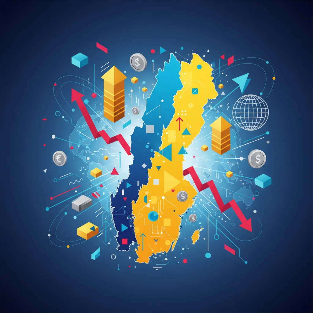
A Tale of Two Nordics: Why Getting the Map Right Matters
To truly appreciate the significance of the FT’s error, it’s worth remembering that Sweden and Finland are not interchangeable. While they share a border and a Nordic identity, their economic landscapes are distinct. Misidentifying them on a map is one thing; misidentifying their economic strengths and investment opportunities is another entirely. For any investor looking at the region, understanding these differences is crucial.
Here is a brief comparison of their economic profiles:
| Economic Indicator | Sweden | Finland |
|---|---|---|
| Primary Industries | Motor vehicles, telecommunications, pharmaceuticals, industrial machines, precision equipment, chemical goods, iron and steel. | Electronics (especially technology and telecom), machinery, manufactured goods, chemicals, timber and paper products. |
| Major Companies | Volvo, Ericsson, H&M, IKEA, Spotify, Klarna. | Nokia, KONE, Stora Enso, Neste, Supercell. |
| Fintech Scene | A global fintech hub, known as the “unicorn factory” of Europe. Strong in payments and “Buy Now, Pay Later” (e.g., Klarna). | Strong B2B and gaming-focused tech scene. Growing fintech sector, particularly in digital banking and wealth management. |
| Economic Philosophy | Historically a model of the “Swedish welfare state,” now with a highly globalized, export-oriented market economy. | A highly industrialized, mixed economy with a per capita output similar to other Western economies. Heavy investment in R&D. |
An investor who “transposes” these two nations might allocate capital based on a misunderstanding of their core markets. They might invest in a Swedish payments company expecting exposure to the B2B tech boom more characteristic of Finland, or vice versa. The details matter. The map must be accurate.
Rewilding the Portfolio: Why Natural Capital is the Next Frontier in Finance
Conclusion: The Imperative to “Check the Map”
The Financial Times’ correction was a small act of journalistic integrity. But its resonance for the world of finance, economics, and investing is immense. It serves as a stark reminder that no system is infallible, no expert is beyond error, and no model is a perfect reflection of reality.
The transposed map of Sweden and Finland is a symbol of every flawed assumption, every overlooked risk, and every cognitive bias that can lead to financial ruin. It teaches us that the most valuable skill in any market is not the ability to predict the future, but the discipline to constantly question the present—to check our data, challenge our beliefs, and, most importantly, to always ensure our map accurately reflects the territory.
For business leaders, investors, and finance professionals, the lesson is simple but profound: before you deploy millions or billions of dollars of capital based on a map you’ve been given, take a moment to verify it. Make sure you know, with absolute certainty, the difference between Sweden and Finland. Your portfolio may depend on it.